Frequency Tables and Charts
Table is a primary way to store data. In general, a column of a table represents a variable and a row stores data associated to an object being observed.
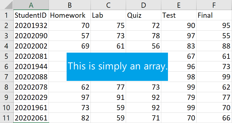
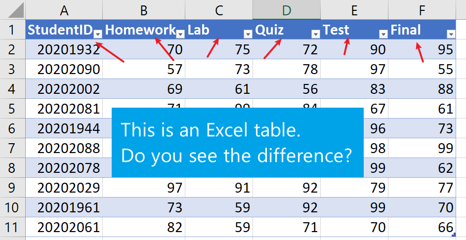
In Excel, a table is not just an array (rectangular block) of data in a spreadsheet, but a special object with many useful properties, such as,
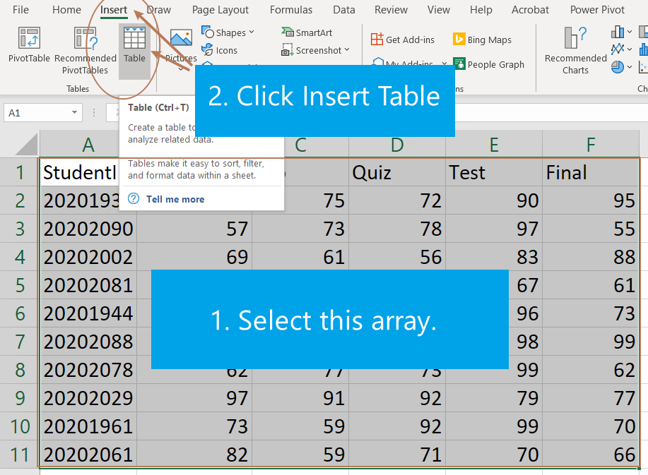
To create a table from an array (rectangular block) of data in Excel
is very easy. Simply select the array and then go to Insert
choose the Table function.
In Excel, to create a frequency table for a data array, we need a bin
array which is used to split the date set into smaller intervals. The
values in a bin array in Excel are (upper) boundaries of intervals. With
a data array and a bin array, we can use the Excel function
FREQUENCY (data_array, bins_array) to create a frequency
table.
In this formula, the value in a bin array is the upper bound of a interval. That is, if the bin array consists of 30, 40, and 50, then the corresponding intervals will be (−,30], (30, 40], (40, 50],(50, + ], where − and + represent respectively numbers smaller and bigger than the minimum of the data set.
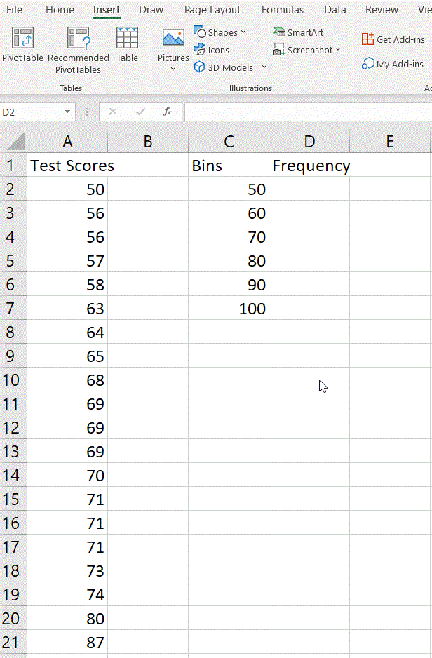
Example: Create a frequency table for the test scores 50 56 56 57 58 63 64 65 68 69 69 69 70 71 71 71 73 74 80 87 using the bin array 50 60 70 80 90 100.
Suppose the test scores are in column A and the bin array is in
column B. Here is how to create a frequency table using the function
FREQUENCY (data_array, bins_array):
=FEQUENCY(,).Hit the Enter, you will get a frequency table.
Note: If you are using an older version of Excel, the formula must be entered by first selecting the output range, entering the formula in the top-left-cell of the output range, and then pressing CTRL+SHIFT+ENTER to confirm it. Excel inserts curly brackets at the beginning and end of the formula for you.
Excel has many built-in chart functions. To create a charts,
Insert tab, click on an appropriate chart in
the Charts command set.The appearance of chart can be changed after being created.
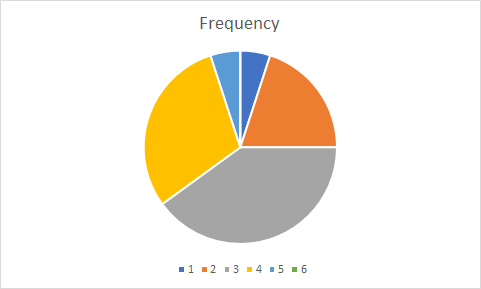
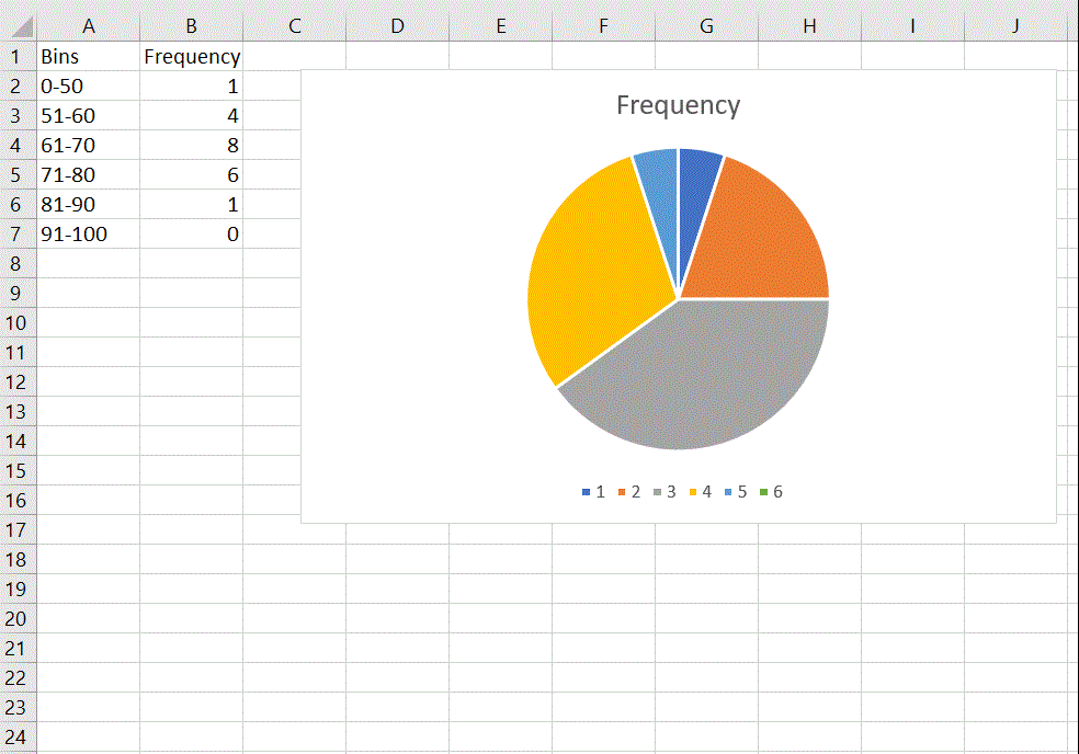
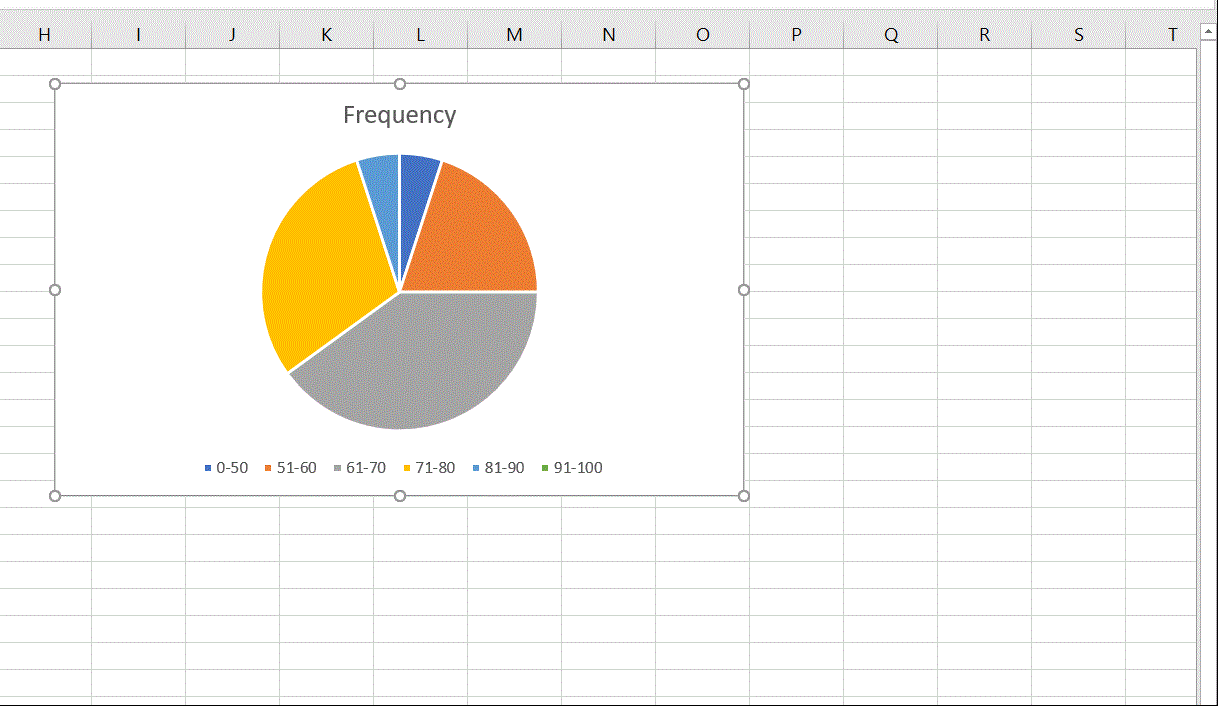
Example: Create a Pie Chart for the following frequency table.
| Bins | Frequency |
|---|---|
| 0-50 | 1 |
| 51-60 | 4 |
| 61-70 | 8 |
| 71-80 | 6 |
| 81-90 | 1 |
| 91-100 | 0 |
Select the frequencies.
Under the Insert tab, click the
Insert Pie or Doughnut Chart.
Using bins as the legend:
Right click the legend (the bottom part of the chart) and choose
Select Data
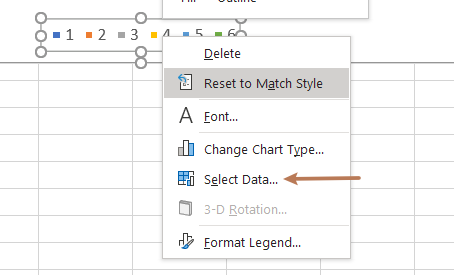
In the popup windows, click Edit horizontal axis
label
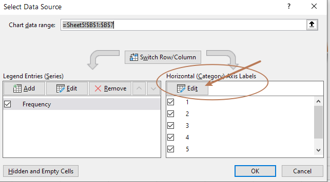
Select bins and click OK and then OK again.
Add data labels or format them
Right click the pie and click
Add Data Labels.
Right click the pie again and click
Format Data Labels, you can then choose formats for data
labels.
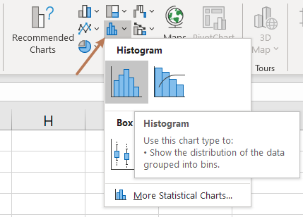
Select the data
On the Insert tab, in the Charts group,
from the Insert Statistic Chart dropdown list, select
Histogram:
Note: The histogram contains a special first bin which always contains the smallest number. This is different from many textbooks.
To format the histogram chart is similar to format a
Pie chart. For example, you can change bin width from
Format Axis.
Right-click on the horizontal axis and choose
Format Axis in the popup menu:
In the Format Axis pane, on the
Axis Options tab, you may try different options for bins.
See the following gif for an example.
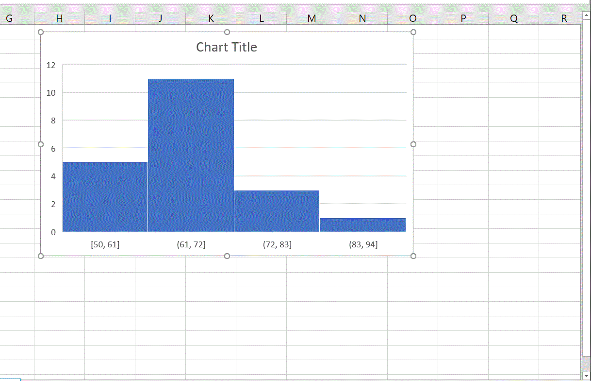
Remark:
Select the Overflow bin checkbox and type the number, all values above this number will be added to the last bin.
Select the Underflow bin checkbox and type the number, all values below and equal to this number will be added to the first bin.
Histograms show the shape and the spread of quantitative data. For categorical data, discrete by its definition, bar charts are usually used to represent category frequencies.
The following data set consists of 20 test scores.
89 62 40 42 9 16 88 73 39 72 71 51 40 37 72 81 36 13 10 70
Using the data set to