Scatterplot
Scatterplots are statistical graphs using coordinates to display two variables for a set of data pairs. The relationship between variables is called correlation. Scatterplots are used to understand the type and the strength of correlation between two variables.
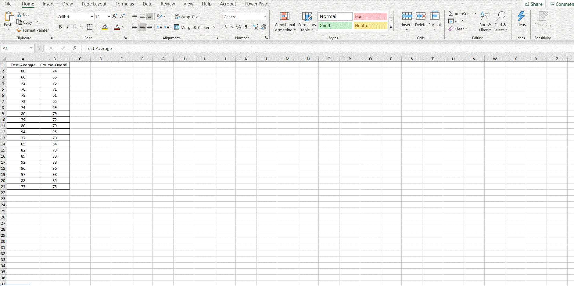
Example: The following table shows the test average and course overall grades of 20 students.
| Test-Average | Course-Overall |
|---|---|
| 80 | 74 |
| 66 | 65 |
| 72 | 75 |
| 76 | 71 |
| 78 | 61 |
| 73 | 65 |
| 74 | 69 |
| 80 | 79 |
| 79 | 72 |
| 80 | 79 |
| 94 | 95 |
| 77 | 70 |
| 65 | 64 |
| 82 | 73 |
| 89 | 88 |
| 92 | 88 |
| 96 | 96 |
| 97 | 98 |
| 88 | 85 |
| 77 | 75 |
Draw a scatterplot for the data and use it to answer the following questions.
Does there seems to be a positive linear relationship? Why or why not?
Does the relationship seems strong or weak? Why?
Solution: To draw a scatterplot, you may follow the instructions below.
Step 1: Enter the set of data pairs, say, in the
region A1:B21 in a new worksheet.
Step 2: Select data arrays in the range
A1:B21.
Step 3: On the Insert tab, click the XY (Scatter) chart command button.
Step 4 (optional): Add a trendline by clicking the Add Chart Element menu’s Trendline command button.
Step 5 (optional): Change bounds for the x-axis by clicking the x-axis and then right clicking to format axis.
Step 6 (optional): Change the title of the picture by clicking the title.
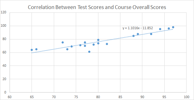
From the scatterplot, we can see that there is a strong positive linear correlation between the test scores and the course overall scores.
The following data set consists of the midterm and the final exam scores of 20 students.
| Midterm | Final |
|---|---|
| 72 | 72 |
| 93 | 88 |
| 81 | 82 |
| 82 | 82 |
| 94 | 88 |
| 80 | 77 |
| 73 | 78 |
| 71 | 77 |
| 81 | 76 |
| 81 | 76 |
| 63 | 68 |
| 73 | 82 |
| 88 | 89 |
| 88 | 92 |
| 96 | 96 |
| 98 | 97 |
| 85 | 88 |
| 75 | 77 |
| 94 | 95 |
| 92 | 88 |
Draw a scatterplot for the data and use it to answer the following questions.
Does there seems to be a positive linear relationship? Why or why not?
Does the relationship seems strong or weak? Why?