

Descriptive Statistics
With many built-in functions, Excel can be used for statistical calculation.
Here is a list of frequently used statistical functions.
| Function | Description |
|---|---|
| AVERAGE function | Returns the average of its arguments |
| MAX function | Returns the maximum value in a list of arguments |
| MEDIAN function | Returns the median of the given numbers |
| MIN function | Returns the minimum value in a list of arguments |
NORM.DIST
function  |
Returns the normal cumulative distribution |
NORM.INV
function  |
Returns the inverse of the normal cumulative distribution |
NORM.S.DIST
function  |
Returns the standard normal cumulative distribution |
NORM.S.INV
function  |
Returns the inverse of the standard normal cumulative distribution |
PERCENTILE.EXC
function  |
Returns the k-th percentile of values in a range, where k is in the range 0..1, exclusive. |
PERCENTRANK.EXC
function  |
Returns the rank of a value in a data set as a percentage (0..1, exclusive) of the data set |
QUARTILE.EXC
function  |
Returns the quartile of the data set, based on percentile values from 0..1, exclusive |
| STANDARDIZE function | Returns a normalized value |
STDEV.S
function  |
Estimates standard deviation based on a sample |
Example: The following table shows the test scores of 20 students.
| Test |
|---|
| 80 |
| 66 |
| 72 |
| 76 |
| 78 |
| 73 |
| 74 |
| 80 |
| 79 |
| 80 |
| 94 |
| 77 |
| 65 |
| 82 |
| 89 |
| 92 |
| 96 |
| 97 |
| 88 |
| 77 |
Solution: Suppose the test scores are
A2:A21.
The mean is given by the function AVERAGE(A2:A21). To
calculate the standard deviation, you can use the method introduced in
class or use the function STDEV.S(A2:A21).
To find the 5-number summary, sort the data from small to large first. Then depends on the convetion, you may use the Excel to find them. See the table below for the functions used in two conventions.
| 5-number summary | Class convetion | Excel convention |
|---|---|---|
| minimum | MIN(A2:A21) |
MIN(A2:A21) |
| lower quartile | MEDIAN(A2:A11) |
QUARTILE.EXC(A2:A21, 1) |
| median | MEDIAN(A2:A21) or
QUARTILE.EXC(A2:A21, 2) |
MEDIAN(A2:A21) or
QUARTILE.EXC(A2:A21, 2) |
| upper quartile | MEDIAN(A12:A21) |
QUARTILE.EXC(A2:A21, 3) |
| maximum | MAX(A2:A21) |
MAX(A2:A21) |
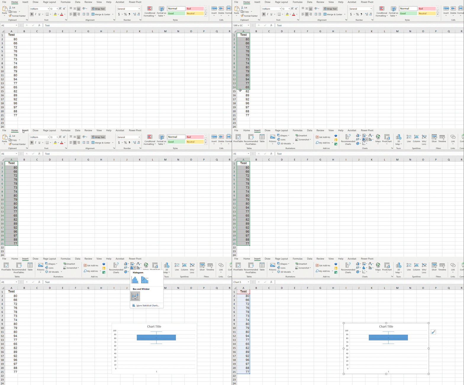
Example: Create a box plot for the test scores in the above example.
Solution: Suppose the test scores are
A2:A21.
Step 1: Select the scores in
A1:B21.
Step 2: Under the Insert tab, click
Insert Statistical Chart.
Step 3: Click the picture below
Box and Wisker. A boxplot will be then created.

Note the boxplot created by Excel uses the convention of weighted mean for the first and third quartiles.
The following data set contains scores of a uniform final from randomly selected 20 students.
| Final |
|---|
| 72 |
| 88 |
| 82 |
| 82 |
| 88 |
| 77 |
| 78 |
| 77 |
| 76 |
| 76 |
| 68 |
| 82 |
| 89 |
| 92 |
| 96 |
| 97 |
| 88 |
| 77 |
| 95 |
| 88 |